Although the quarterly New York Fashion Week shows are the biggest trend forecaster for the upcoming year and influence every aspect of design, not merely fashion, the hot place to look for color trend forecasting is the Pantone Color Institute’s seasonal Color Trend Reports.
Their forecast for Fall 2018 was on target, as usual: “a modern fall palette of deep and rich tones with outbursts of colorful surprise.” But…. What do they mean by colorful surprise?
Well, as Leatrice Eiseman, Executive Director of the Pantone Color Institute, notes, “As designers and consumers alike continue to transition away from cyclical trends, and instead focus on self-expressive colors that evade antiquated seasonal structure, we are seeing very notable nontraditional choices.”
In other words, Fall event design is trending away from traditional seasonal color schemes. Designers will be focusing more on self-expressive colors and surprising pops of color.
Here are three examples of how you can use these ideas when planning your Fall events:
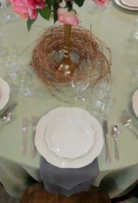
This first look is great for Fall because it gives a nod to soft, natural colors and textures without being traditionally brown and orange. It focuses on soft gray combined with celery green to bring a timeless and sophisticated elegance to your event.
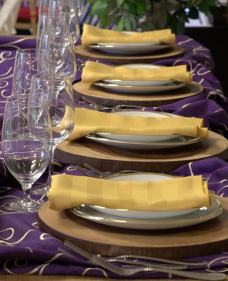
If you want more punch to the look of your event, try using two complimentary colors, like this vivid purple and a bright yellow. You’ll always get the most energy when you combine two colors that are directly across from each other on the color wheel, because you are using the maximum amount of color contrast, adding excitement to the tablescape.
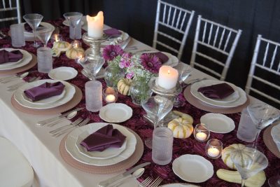
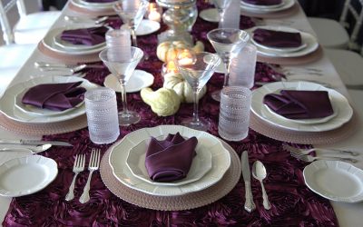
Our final palette features a table runner and napkins in deep wine and burgundy, but softens and updates this deep, rich, traditional look with pale pinks and creams in the chargers, china, and centerpieces.
To see our full selection of linen colors, check out the Linens page of our website, or visit us in our Design Center for personalized assistance!
